Submission
- https://frontier.pioneer.app/posts/136199d5-greatalbum-net-progress-update-june-6th-2021
KPI: results
- MVP2 done: 20%
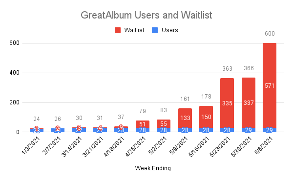
- Users+waiting list: 600 of 2000 goal
- Media cataloged (imported/uploaded): 1786 of 4000 goal
Quick reminder: what are you building, in a sentence?
- GreatAlbum helps you consolidate & organize your photos/videos across services/devices to share and relive experiences with family & friends
Here’s what you planned to do this week:
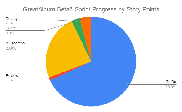
- ⏭️Beta6 sprint 50% to be done
- 🎨Blog design implemented; GreatAlbum Style Guide
- 📸Google photos importer v3 released
- 📸Media recognition prototype enhanced
- 📽️Demo video v4
- 👨💻DevOps best practices session with expert
- 📰1-2 Blog posts
What did you accomplish this week? Did you do everything you planned?
- ⏭️Beta6 sprint 50% to be done
- 🎨Blog site redesign almost implemented; App site Style Guide done
- 📸Google photos importer v3 bug fixes 90% done
- 📸Media recognition prototype 25% done
- 📽️Demo video v4 done
- 📰Blog post https://bit.ly/3cplSkn
- 📊Journal & KPIs https://bit.ly/3ppTXWZ
What do you want to have done by the end of next week?
- ⏭️Beta6 sprint 70% done
- ⏭️Beta 7 Objectives and Roadmap done
- 🎨GreatAlbum blog site redesign implemented
- 🎨GreatAlbum app redesign 33% done
- 📸Google photos importer V3 done
- 👨💻DevOps best practices session with expert to be done
- 📰1-2 Blog posts
What would you like feedback on from the community?
- http://45.40.138.118/great-album new design
- https://bit.ly/3uWvrhd overall demo
- https://bit.ly/3fUkN6c album demo
- http://bit.ly/ga-pitchdeck
Project website
Which of these best describes the stage of your project?
- Privately testing with users
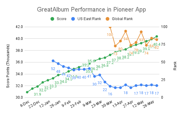
KPI Dashboards


![]()
![]()
Feedback from Pioneer Members
mkaic
The only things that really stood out to me was that the color palette is possibly a bit *too* vibrant/high-contrast (though contrast is definitely desirable for accessibility, so...), and that the text inside the semi-transparent boxes overlayed on the blurred picture of the flowers felt a little hard to read -- maybe a heavier font-weight or a more solid background?
Overall I like your design. Best of luck!
projectoasis.ch
That's a great idea, I can relate to that. You provide a lot of material and that can be hard to focus on what to give feedback, maybe add a specific question next time. The landing page is nice, it could maybe show the problem solution in one picture / phrase to simplify understanding the service.
richfeyn-rashmi
This is great idea to enable us to view our story and share with others.
In the landing page, you can add 'sort by time' feature to view the story of our lives with college friends or family etc.
Demo video &pitch is great but you can probably add a video/slide as to how the current users have been browsing or prefer to browse from time to time to capture their feeling when they walk down the memory lane.
